Have Any Questions
Red Wholesale
A high-velocity, geometric brand identity for an industrial wholesale distributor engineered for scale, momentum, and marketplace authority.
-
ClientRed Wholesale (RWS)
-
IndustryWholesale Supply, B2B Distribution & Logistics
-
ServiceBrand identity system & guidelines
-
PeriodMar to May 2023
-
LocationLahore, Pakistan
The brief
Red Wholesale (RWS) is a rapidly expanding B2B wholesale distribution partner supplying high-turnover consumer goods, packaged sundries, and commercial supplies to regional retail networks. In a competitive wholesale sector dominated by unbranded logistics houses and dated, generic supplier badges, Red Wholesale commissioned Wangard International to build a modern, high-impact brand identity.
The strategic objective was twofold: establish an instantly recognizable signature mark that communicates forward momentum and supply-chain efficiency, while engineering a flexible visual design language that functions flawlessly from outdoor high-rise billboards and fleet trucks to mobile apps, invoices, and warehouse packaging.
Interlocking 'RWS' monogram
Industrial color architecture
Dynamic diagonal chevron geometry
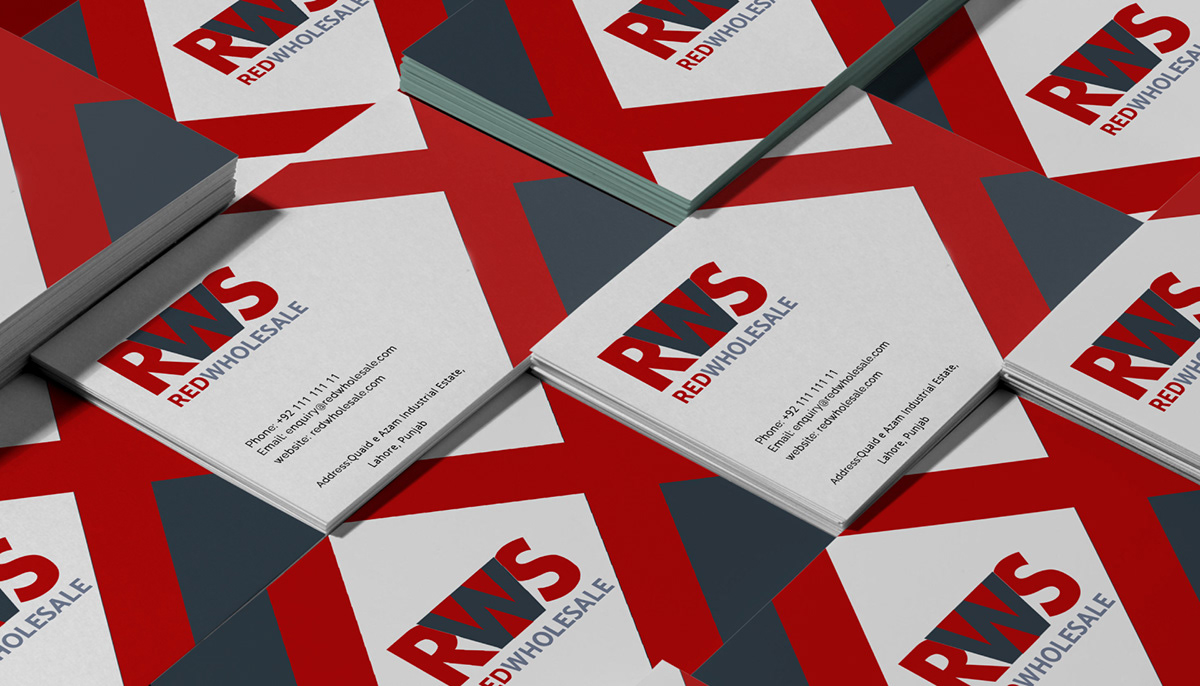
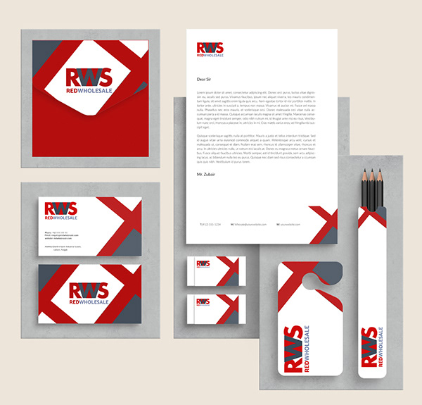
Corporate corporate identity & stationery
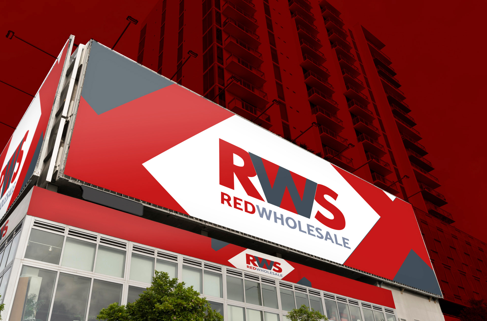
High-visibility urban outdoor signage
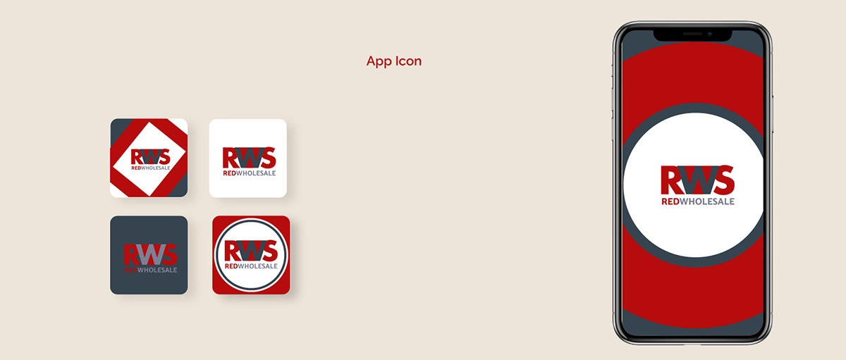
B2B ordering mobile app icon set
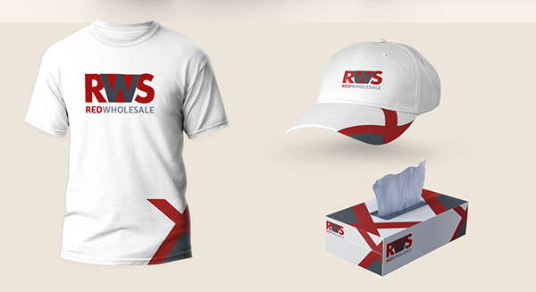
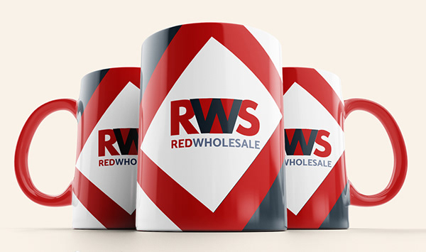
Staff workwear & branded merchandise
Comprehensive brand standards guide
The mark
Interlocking 'RWS' Architecture
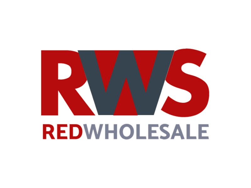
The monogram fuses the letters R, W, and S into a cohesive single silhouette where the central slate 'W' acts as a fulcrum connecting the red letterforms.
Dynamic Angle of Convergence
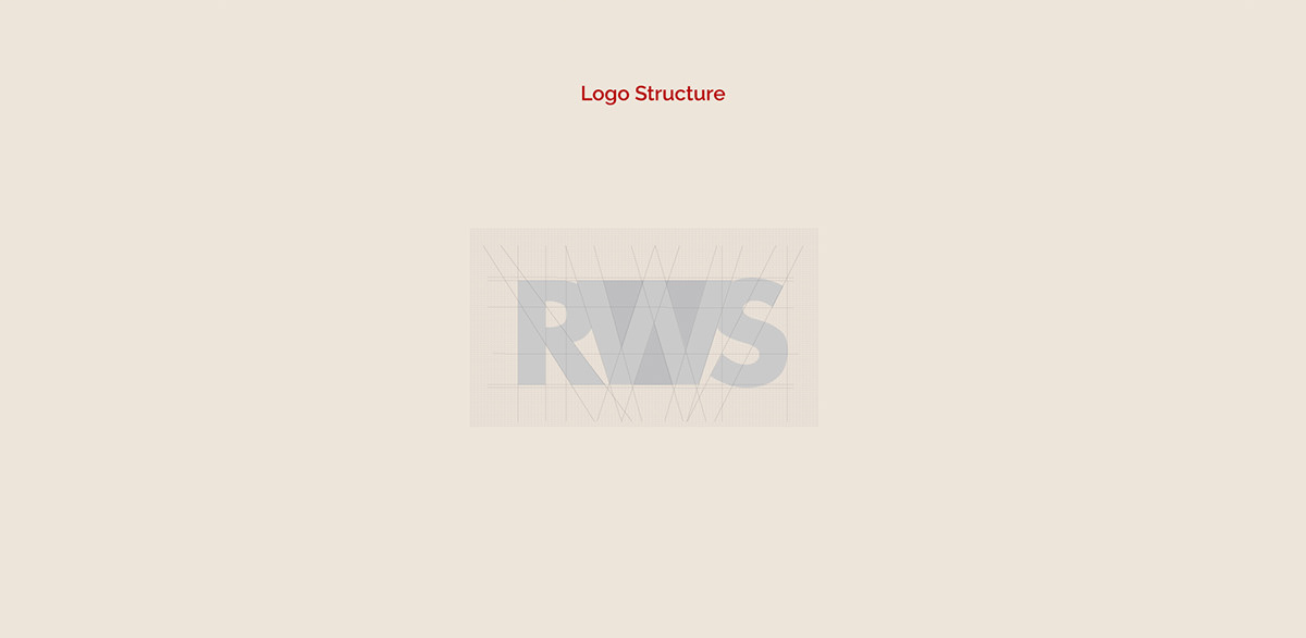
The angular diagonals of the 'R' leg and 'W' vertex share an identical degree slope, creating rhythmic visual speed and forward momentum.
Layered Color Depth
The deep industrial slate (#36444f) overlaps the vibrant crimson (#c20c0c), providing dimensional depth and solid grounding to the wholesale moniker.
Bold Tracking Wordmark
Set directly beneath the monogram, the capitalized RED WHOLESALE typography ensures instant legibility at great distances and small print scales.
Logo suite
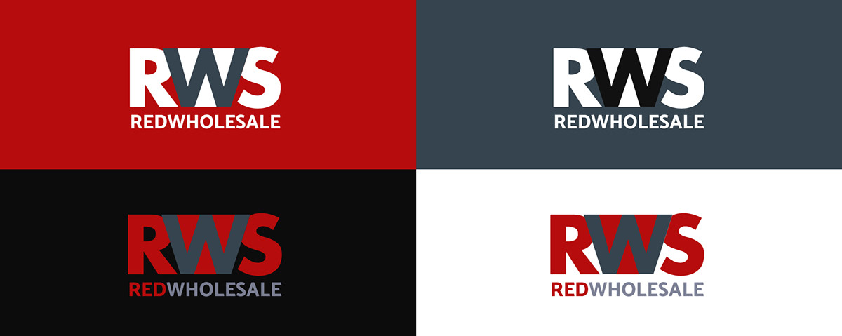
A versatile suite engineered for high contrast across diverse manufacturing, logistics, and digital applications. The lockup maintains high recognition in full color, dark slate, deep black, and reverse white.
Clear space & diagonal motif
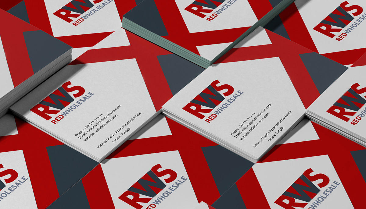
The Diagonal Ribbon: A signature visual asset derived from the geometric vertices of the 'W'. The overlapping red and slate diagonal band creates high visual energy across business cards, envelopes, merchandise, and warehouse signage.
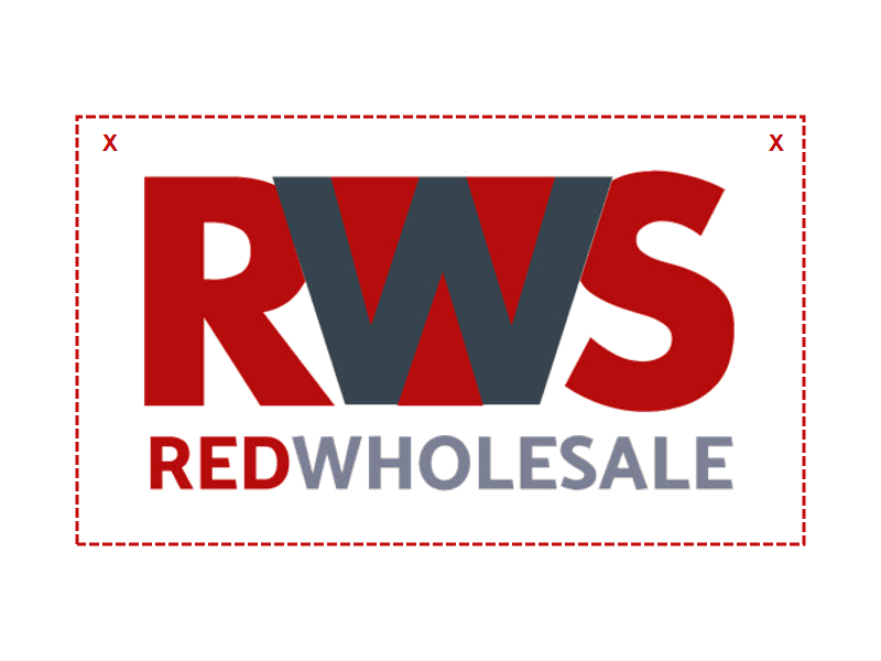
Exclusion Zone: Maintain a minimum clear space equal to the stroke width of the letter 'R' around all perimeters of the logo mark. No competing typography or borders may breach this safe zone.
Minimum Sizing: In digital applications, the master lockup must never appear below 120px in width, and the standalone app icon must maintain at least 32px to safeguard the integrity of the inner intersections.
Color palette
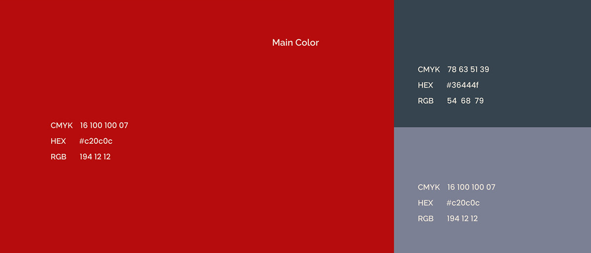
An assertive, high-impact palette balancing vibrant wholesale energy with industrial precision and corporate reliability. Click any swatch below to copy its HEX value.
Crimson Red
Primary. Energy, urgency, wholesale momentum
HEX #c20c0c
RGB 194 12 12
CMYK 16 100 100 07
Industrial Slate
Primary Dark. Solidity, logistics authority, structure
HEX #36444f
RGB 54 68 79
CMYK 78 63 51 39
Steel Grey
Secondary. Wordmark, secondary accents, borders
HEX #747f8d
RGB 116 127 141
CMYK 55 40 33 08
Warm Canvas
Base. Packaging, paper stock, presentation background
HEX #f4f2ee
RGB 244 242 238
CMYK 02 02 04 00
Standard palette allocation: 55% Crimson Red, 25% Industrial Slate, 12% Steel Grey, 8% Warm Canvas & White.
Aa
4.9:1 Pass (Large)
Aa
8.4:1 Pass (AAA)
Aa
8.4:1 Pass (AAA)
Aa
14.8:1 Pass (AAA)
Typography
Aa
Schibsted Grotesk / Heavy Sans
Wordmarks, display headings, packaging hierarchy, and warehouse signage. Unflinching geometric legibility.
ABCDEFGHIJKLMNOPQRSTUVWXYZ abcdefghijklmnopqrstuvwxyz 0123456789
Aa
Newsreader Editorial
Corporate storytelling, executive correspondence, legal contracts, and wholesale catalogs.
ABCDEFGHIJKLMNOPQRSTUVWXYZ abcdefghijklmnopqrstuvwxyz 0123456789
Logo do's and don'ts

✅ Use the primary logo on clean white and light neutral grounds.

✅ Use on the brand warm neutral canvas for packaging and stationery.

✅ Use the reversed white mark on Industrial Slate or dark surfaces.

✅ Preserve minimum clear space equal to margin X around all perimeters.

❌ Distort, squeeze, or stretch the logo proportions.

❌ Alter brand colors or apply unapproved hues and gradients.

❌ Rotate the lockup or add drop shadows and artificial effects.

❌ Place the logo on busy patterns or low-contrast backgrounds.
The brand in use
From high-impact metropolitan outdoor advertising to corporate stationery, digital ordering apps, and commercial merchandise.
Client feedback
"Wangard gave Red Wholesale the stature and unmistakable velocity of an international logistics powerhouse. Our distributors recognized the shift immediately, and the identity system translates seamlessly from 10-meter billboards down to our handheld scanner app."
Mr. Zubair
Managing Director, Red Wholesale
Success is a team effort let’s achieve it together
sales@wangardinternational.com
+1 (347) 553-2176
Mohsinjawa@gmail.com