Gloss Me Up

GlossMeUp is a beauty brand spanning cosmetics, hair care, vitamins and supplements. 

  • Client            
    GlossMeUp
  • Industry       
    Beauty & Wellness
  • Service         
    Brand identity and guidelines
  • Period          
    Mar to May 2026
  • Deliverables
    Logo suite, palette, typography, app icon, stationery, brand guidelines
  • Website       

The brief

GlossMeUp is a beauty brand spanning cosmetics, hair care, vitamins and supplements. Their existing identity was fragmented — no consistent mark, mismatched color usage across packaging, digital, and print, and no system their own team could reliably follow.

The goal: one premium lettermark that feels confident on a supplement bottle, an app icon, and a luxury business card — simultaneously.

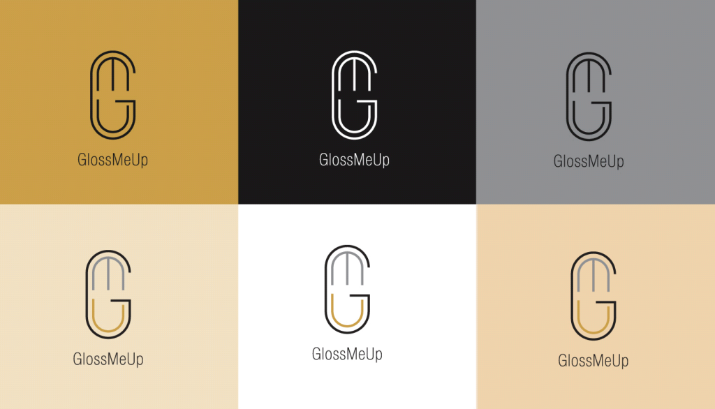
Lettermark logo suite

Color palette

Type system

App icon variants

Stationery set

Brand guidelines

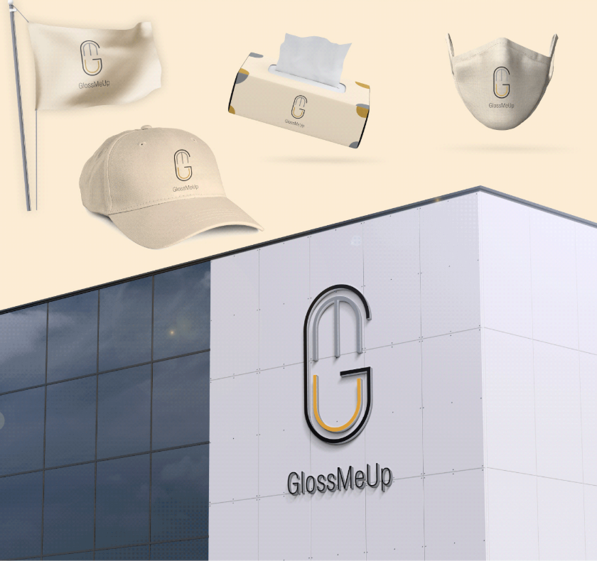
Merchandise applications

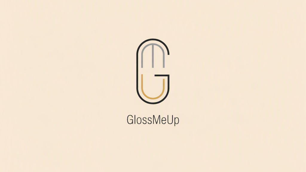
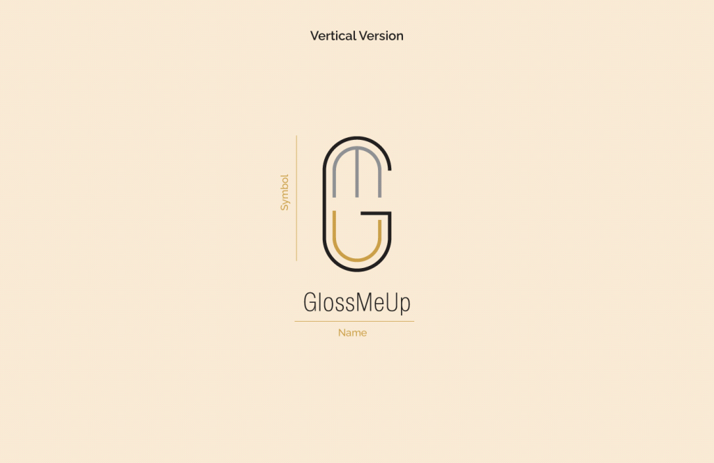
The mark

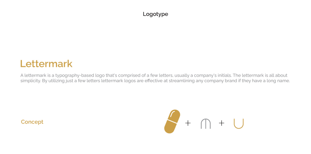
The capsule

An elongated pill form nodding directly to the vitamins and supplements at the brand's core. It also doubles as a bold, ownable container for the monogram.

The M arch

A steel-gray double arch in the upper half. Architecturally precise — it brings structure and a sense of measured confidence.

The gold U

A warm gold U curves through the lower half, referencing both the brand name's final letter and a soft, inviting openness.

Together: the G

The capsule silhouette with the internal arches reads as a bold uppercase G — the brand's initial. Three layers, one cohesive mark.

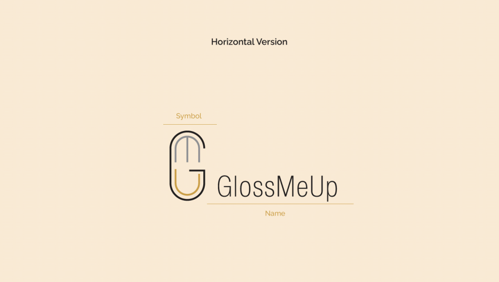
Logo suite

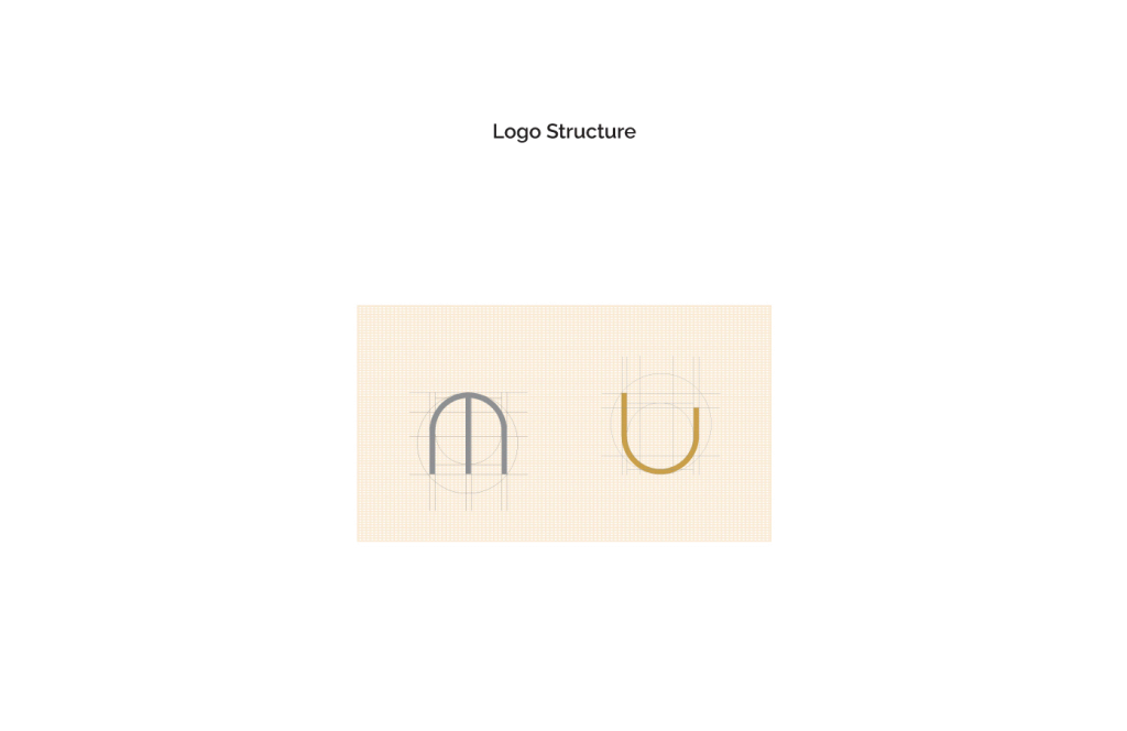
Clear space and size

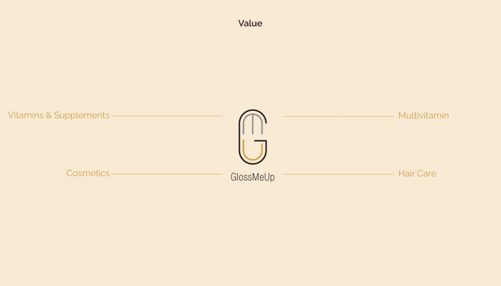
GlossMeUp competes across three beauty verticals simultaneously: cosmetics, hair care, and vitamins & supplements. The identity communicates both clinical credibility and aspirational luxury — anchored by the core brand value of tangible, visible results.

Color palette

Swatch widths show how much each color is used. Select a value to copy it.

Gold

Primary. Logo accent, CTAs, key highlights

HEX #cda248
RGB 205 162 72
CMYK 20 35 85 1

Steel

Secondary. M arch, neutral surfaces

HEX #919395
RGB 145 147 149
CMYK 46 37 36 2

Charcoal

Dark base. Backgrounds, body text

HEX #221f1f
RGB 34 31 31
CMYK 70 67 65 74

Usage balance: 45% Gold, 30% Cream, 15% Steel, 10% Charcoal.

Aa

6.8:1 Pass

Aa

6.8:1 Pass

Aa

13.2:1 Pass

Aa

3.4:1 Large text

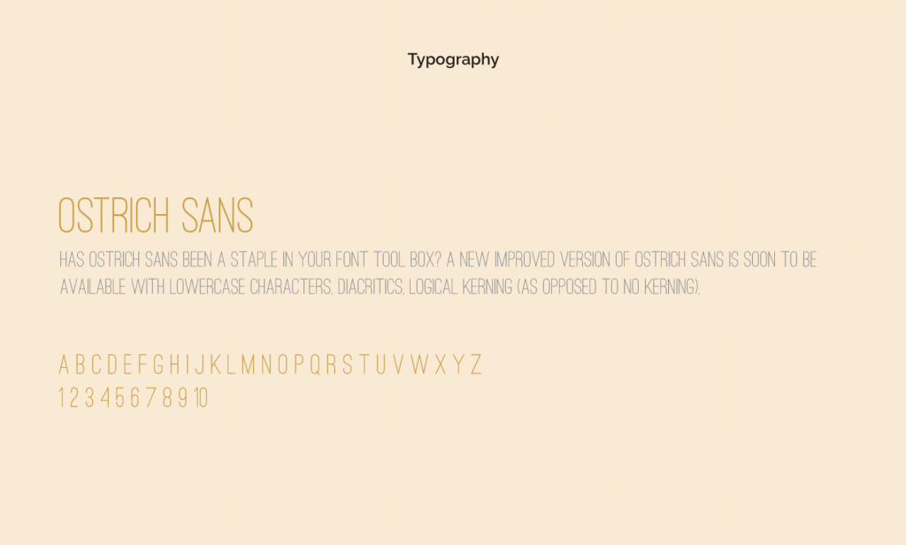
Typography

Aa

Cormorant Garamond

Headlines and short statements. One weight, used large.

ABCDEFGHIJKLMNOPQRSTUVWXYZ abcdefghijklmnopqrstuvwxyz 0123456789

Aa

Jost

Body text, captions and buttons. Regular, Medium and Bold.

ABCDEFGHIJKLMNOPQRSTUVWXYZ abcdefghijklmnopqrstuvwxyz 0123456789

The brand in use

From business cards to building signage — a consistent, premium presence

across every touchpoint.

Business cards

App Icon

Branding

Social mockup

Client feedback

"The mark speaks for itself. We put it on our packaging, our app, and our storefront sign — and for the first time, they all feel like they belong to the same brand."

Brand Director

GlossMeUp

icon
Get in touch

Success is a team effort let’s achieve it together

sales@wangardinternational.com

+1 (347) 553-2176

Mohsinjawa@gmail.com

(+92) 333-926-4273